There’s a new fad in the financial independence subreddit, one that might be fun for Get Rich Slowly readers to play around with. People have discovered Sankey diagrams, a type of chart that makes it easy to visualize data flows. That sounds sort of geeky, I know, so it’s probably best to show an example. Or four.
Perhaps the most famous example of a Sankey diagram (certainly the example I’ve seen most often) is Charles Minard’s map of Napoleon’s disastrous invasion of Russia:
The Minard map has been called “the best statistical graphic ever drawn”. And now, for some reason, people have begun to adopt the same style to visualize their earning and spending.
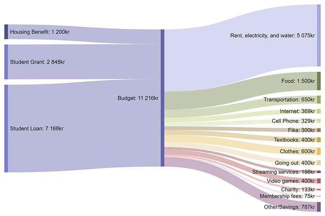
Here, for instance, is a graph created by a 20-year-old student from Stockholm, Sweden:
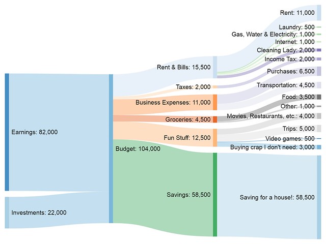
Here’s the chart for an architect living in Buenos Aires, Argentina:
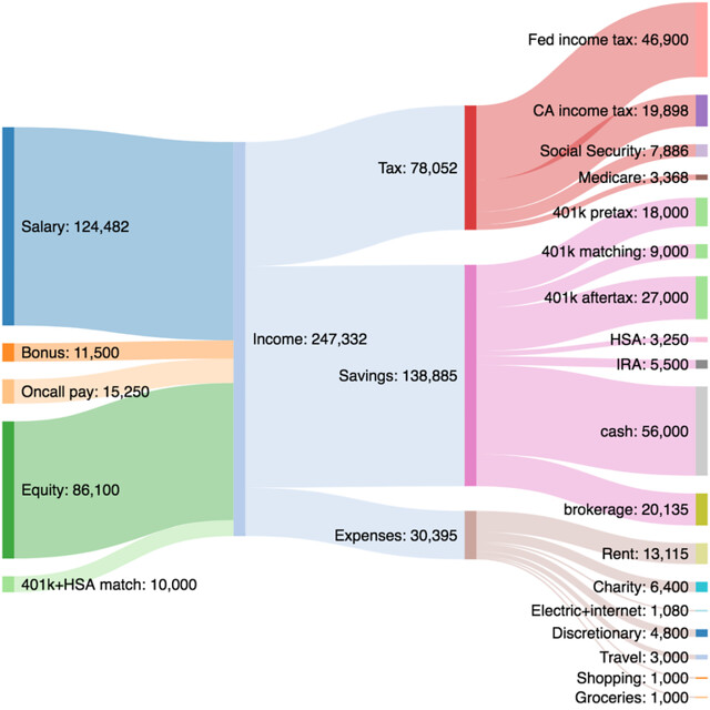
And here are the numbers for a 26-year-old unmarried female computer programmer who lives in the Bay Area:
As you can see, Sankey diagrams really do make it easy to visualize certain data flows, including household budgets. You can track how various sources of income all enter a common pot, and then are disbursed to fund different aspects of your life.
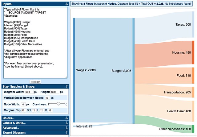
Why are these visualizations so popular all of a sudden? I think it’s because somebody stumbled upon Sankeymatic, a free online tool that allows anyone to build a Sankey diagram from their own data. This tool is highly customizable and includes a short but useful manual.
If you have the time (and the data), I highly recommend using Sankeymatic to visualize the budget flow for your household.
I haven’t done a Sankey diagram for my own budget, but I plan to do so soon. Since May of this year, my expenses have been, well, out of whack. It’s not that I’m indulging or anything, but once Kim and I decided to purchase this home, we entered a short-term phase where nothing was normal. Things have finally settled, however, and I intend to resume regular expense tracking in January.
(I’m doing it now, actually, but I’ll resume reporting in January. And when I do, I’ll do a Sankey diagram every month!)
[For far more than you ever wanted to know about Sankey diagrams and flow maps, check out this extensive discussion at Edward Tufte’s site.]
The post Visualize your budget flows with a Sankey diagram appeared first on Get Rich Slowly.
Via Finance http://www.rssmix.com/


No comments:
Post a Comment